


Want to create better, more beautiful Revit Drawings?
As you will more than likely be aware, Autodesk Revit is a great tool for parametric modelling and drafting, but you may be less familiar with some of the presentation tools available within Revit which are there and ready to be used. And as we know more often than not, images speak louder than words. The images we create as architects and designers need to convey and capture design intent quickly and correctly so this can be communicated to the wide range of stakeholders involved in any project.
So let’s dive in and let BIM Manager Nicolas Catellier from Revit Pure show you how to create beautiful images and better Revit drawings that your clients, contractors will be inspired by.
8 TIPS TO CREATE BEAUTIFUL DRAWINGS IN REVIT

Most architects think that Revit is a terrible presentation tool. They are wrong. And this guide is going to prove it. You don’t need sketchup or Photoshop to create interesting conceptual documents.
In this post, we are going to use the project provided by Wolfgang Sirtl. Check out this firm website over here: http://www.qsp-architekten.de/
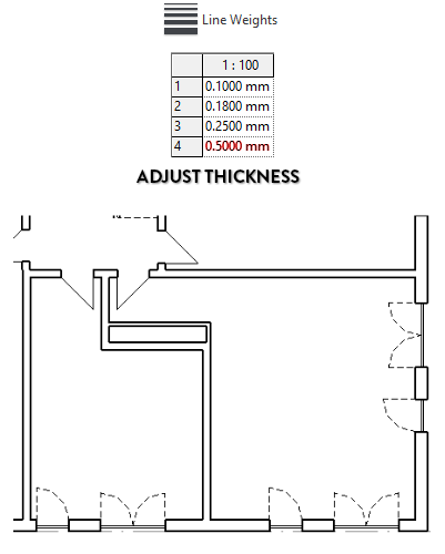
1- ADJUST LINE WEIGHT
A common criticism of Revit is the difficulty to adjust the line weight of elements, especially in elevations and 3D views. In the plan view below, you can see that the line thickness hierarchy is not great… the drawing appears flat. The cut walls line thickness is set to 4, meaning it will print at .35mm. That’s pretty thin.
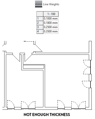
Let’s go to the Line Weights menu. Go to the Additional Settings dropdown menu in the Manage tab. Select the Line Weights tool. Adjust the number 4 thickness for the correct scale. In the example below, we boost the thickness to 0.5mm. The drawing looks much better!
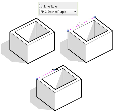
The Line Weights menu is not the only way to affect the thickness. The Linework tool (shortcut: LW) allows you to replace the style of a single line. In the example below, we override a 3D edge to a purple dashed line. Drag the blue dot to adjust the line override boundary.
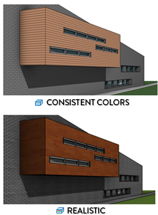
2- UNDERSTAND WHICH VISUAL STYLE TO USE
Revit offers 6 different visual styles. Think carefully about which one to use. For conceptual views, Consistent Colors is often a great choice. Hidden Lines might also be interesting. When you are ready for images that are more realistic, the Realistic style and rendering.
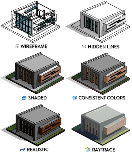
A confusing feature of Revit is the difference between the Graphics and Appearance properties of a material. The settings in Graphics will be used in Wireframe, Hidden Lines, Shaded and Consistent Colors styles. The appearance settings, where you can set image textures, are used for Realistic, Raytrace and renderings.
In the image below, we adjust a brick material. In the Graphics tab, we set a line pattern and a colour to be used in shaded/consistent colours visual style. Go to the appearance tab and we set an actual brick texture image.
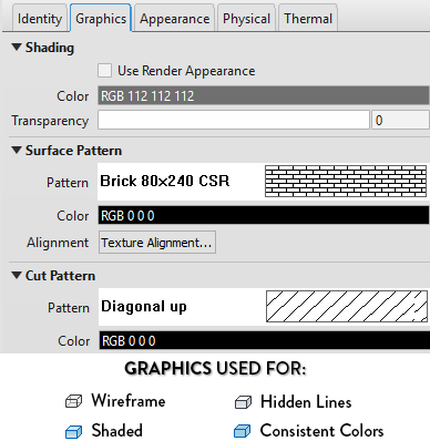
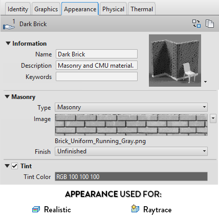
As you can see below, Consistent Colors will display materials using line pattern, while Realistic will display the material using image textures.
3- CREATE A POCHE CUT STYLE
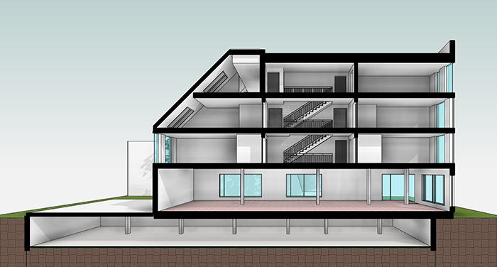
For presentation documents, you probably don’t want to see a bunch of wall and floors layers. For example, this is what a “default” section-perspective will look like.
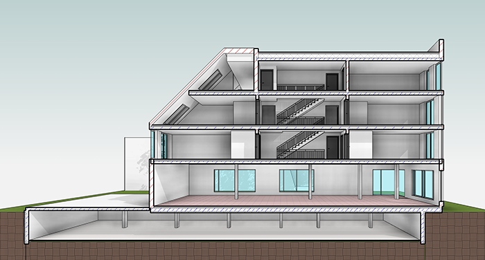
To give more punch to this drawing, let’s create a poche for all walls, floors, roofs and columns elements. Go to the Visibility/Graphics menu by using shortcut VG. Set a dark solid color fill for the cut pattern of all elements, except topography.
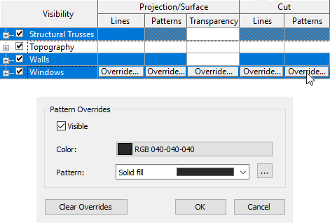
As you can see below, your Revit drawings are suddenly more much interesting.
This technique can also be used in regular sections and plan views.
4- MASTER THE SHADOWS FOR REVIT DRAWINGS
Time to use your dark wizardry skills to create shadows.
There is 2 types of shadows in Revit: Cast Shadows and Ambient Shadows.
You can click on the small sphere icon at the bottom of your screen to activate cast shadows. But the best way to do it is to go to the Graphic Display Options menu by clicking on the cube at the bottom of your screen.
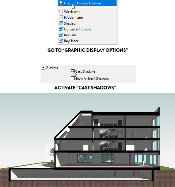
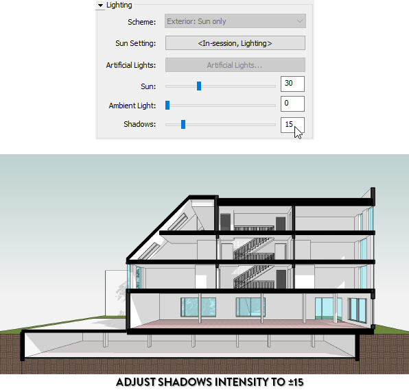
Woah! That’s way too dark. Go back to Graphic Display Options menu and then to the Lighting submenu. Set the shadows intensity between 10 and 15.
Better. But we need Ambient Shadows. Go back to the shadows submenu and activate the option.
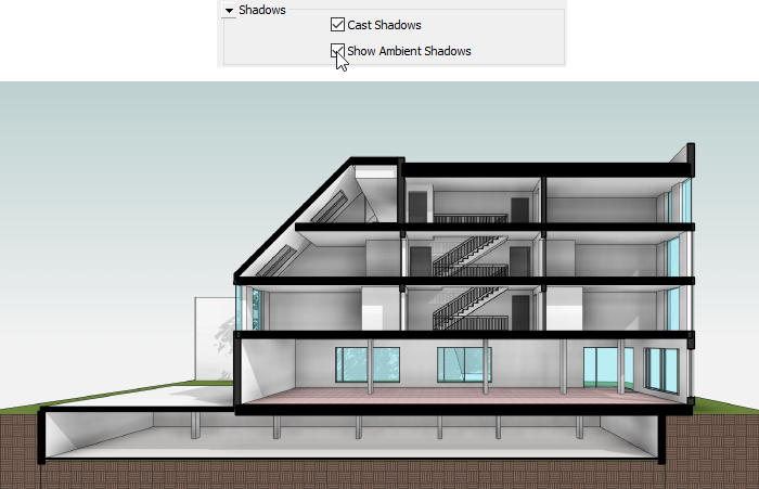
That’s it! Now that’s a good looking view. The only problem with Ambient Shadows is that you can’t control the intensity of the effect. In black and white views, it sometimes turns out to be too intense.
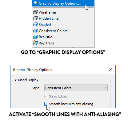
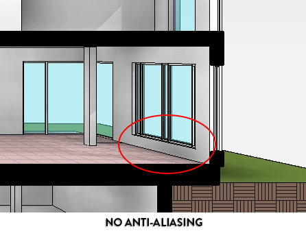
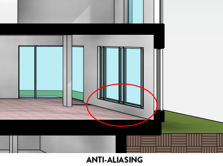
5- ACTIVATE ANTI-ALIASING FOR REVIT DRAWINGS
Aliasing occurs in a drawing when angled lines appear pixelated. Go to the Graphic Display Options menu. Under “Model Display”, check the “Smooth lines with anti-aliasing” box.
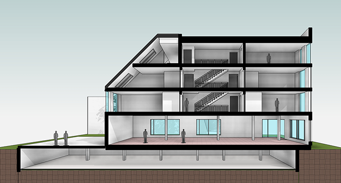
6- USE CUSTOM ENTOURAGE
The default trees and entourage characters in Revit are not pretty. If you want to show people in your views without having to use Photoshop, your best bet is to create or download custom families.
In the example below, we populate the section-perspective with default Revit entourage RPC families.
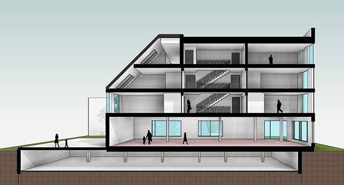
Let’s fix the image by using custom made entourage families. Better, isn’t it?
7- UNDERSTAND HOW TO USE GRAPHIC OVERRIDES
By default, the graphic styles of all model elements are controlled by the Object Style menu and the material assigned. For example, the wall below has a concrete material assigned, which will determine the patterns. The line thickness is controlled in the Object Style menu, located in the Manage tab

What if you want to modify the visual style of this wall, but only in a specific view? That’s when you have to use overrides. In the image below, we use multiple overrides to affect the graphic display of the wall.

To create presentation documents, you have to use overrides to affect an entire drawing. This way, you can have both a construction plan view and a presentation plan view with completely different graphic styles in the same model.
The chart below explains how Revit decides which tool to prioritize when drawing an element. That means an element with a Linework override will have priority over an element affected by a view filter or by a phasing setting. The low priority settings usually have a broad effect on the project at large, while the high priority are usually specific to single elements.
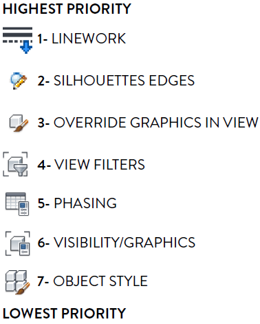
For presentation purpose, the Visibility/Graphics menu is useful to overrides all elements in the view. Then, you can make adjustments on specific elements by using tools like Override Graphics In View and Linework.
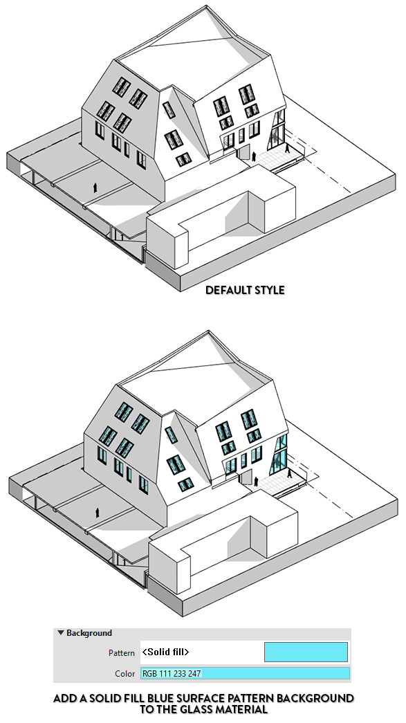
8- USE COLORED PUNCH IN BLACK AND WHITE VIEWS
Black and white views can be charming. In theory, the Hidden Lines style is always black and white. But it is actually possible to set a coloured override to a specific element. In the image below, we modify the glass material and set a solid fill surface pattern in the background. The blue tint creates an interesting punch to the view.
Thanks to www.revitpure.com for allowing us to publish their blog and here’s a link to their Revit Design Package which is well worth having a look at.
Need help with the fundamentals first?
Enhance your drawing skills with our Revit Architecture Fundamentals course. Delve into the essentials of Autodesk Revit, discovering the art of constructing a full 3D architectural project model. Master the user interface, drawing tools, and editing techniques to elevate your proficiency.
For more information please contact us today!